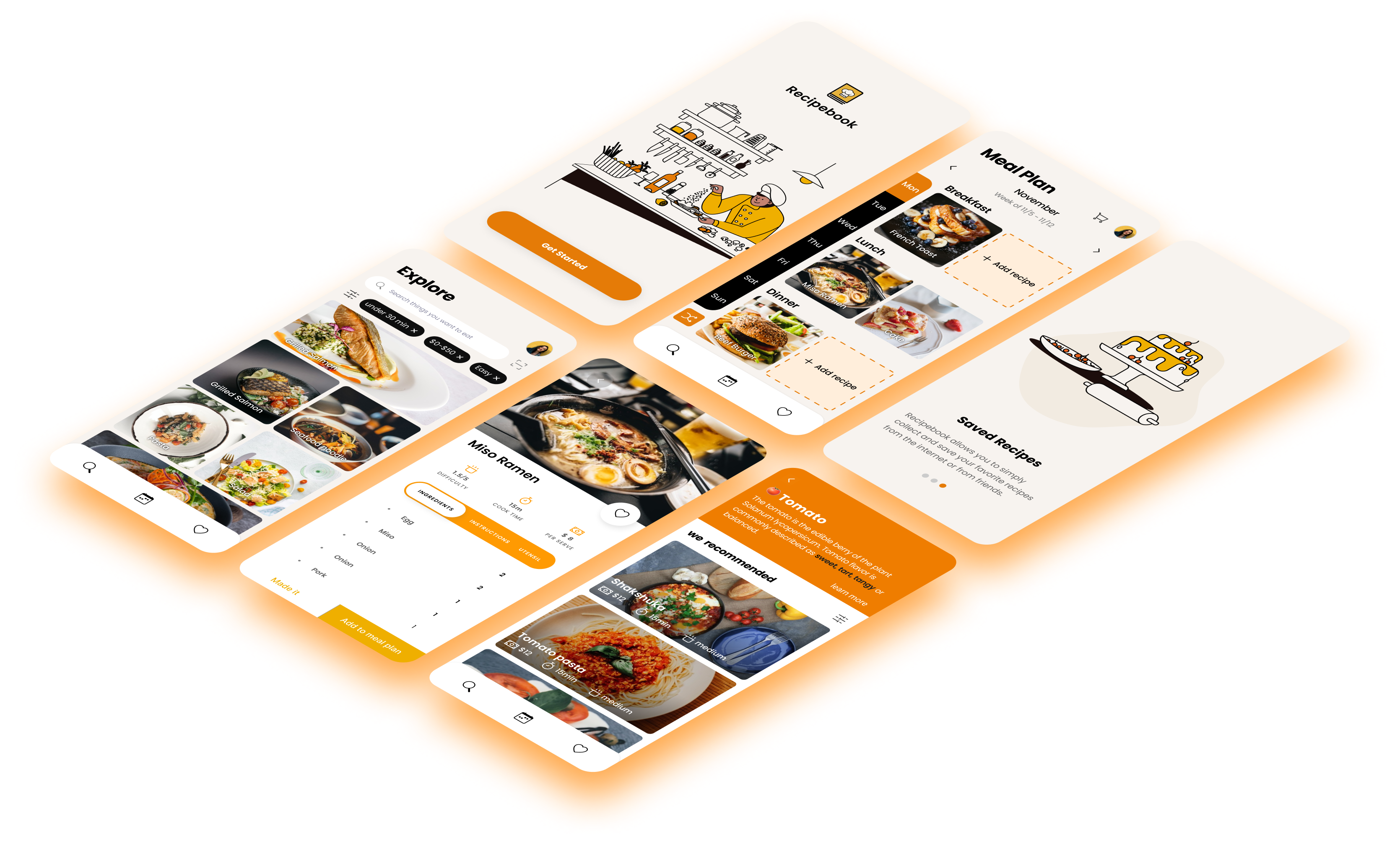
My role: UI/UX Designer Front-end Developer
Tools: Figma Miro Vue.js
Skills: User Research, Ideation, Rapid
Prototyping, User Testing, Visual Design
Timeline: 3 months
How might we design a way for college students to cook meals more regularly and consistently?
Customized meal plan
AR-SCAN Object Recognition
Collect favorite recipes from everywhere
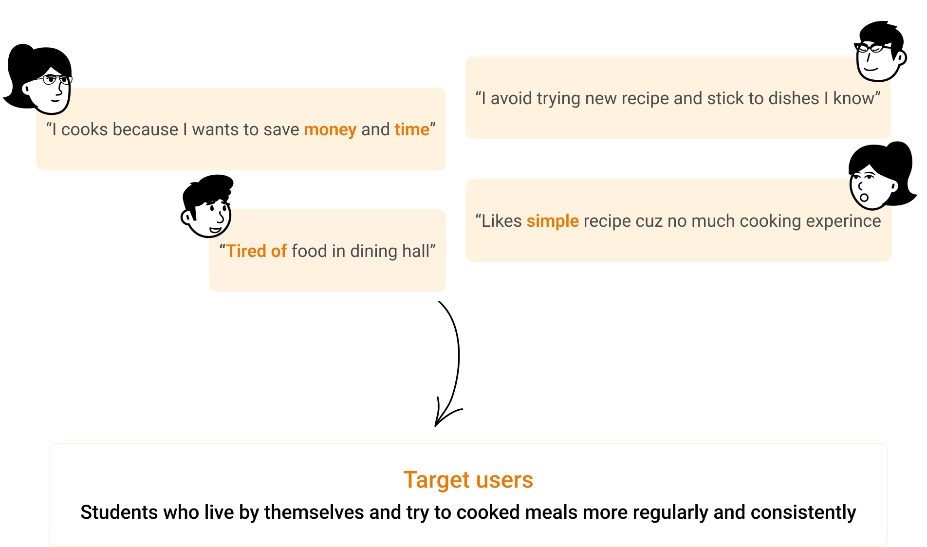
Interview & Affinity Mapping
To better understand how students cook in their daily life and identify potential problems, I advocated for conducting Semi-structured Interviews first before diving into solutions. I also encouraged our developers to join us for affinity mapping sessions so that we could brainstorm solutions as a group based on our results.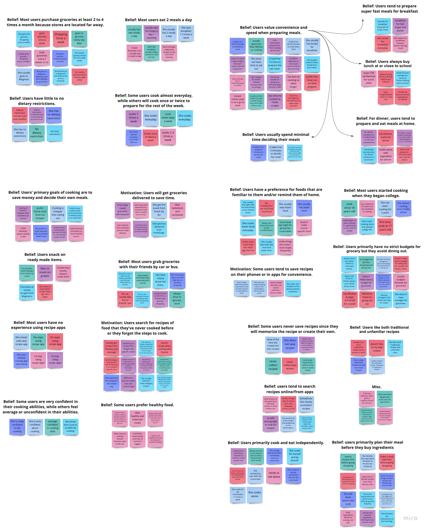
Main pain points faced
- 🙁 Missing ingredients when trying to cook something
- 🙁 Cooking takes students too much time and eventually order delivery
- 🙁 Lack of food knowledge, do not know what to buy at store and what those ingredients can be cooked for. Ends up cooking same dishes.
- 🙁 Recipes that do not correspond to their prior cooking experience make them feel less confident
- 🙁 They have no way to collect their favorite recipes, so they have to look for them every time they want to eat.
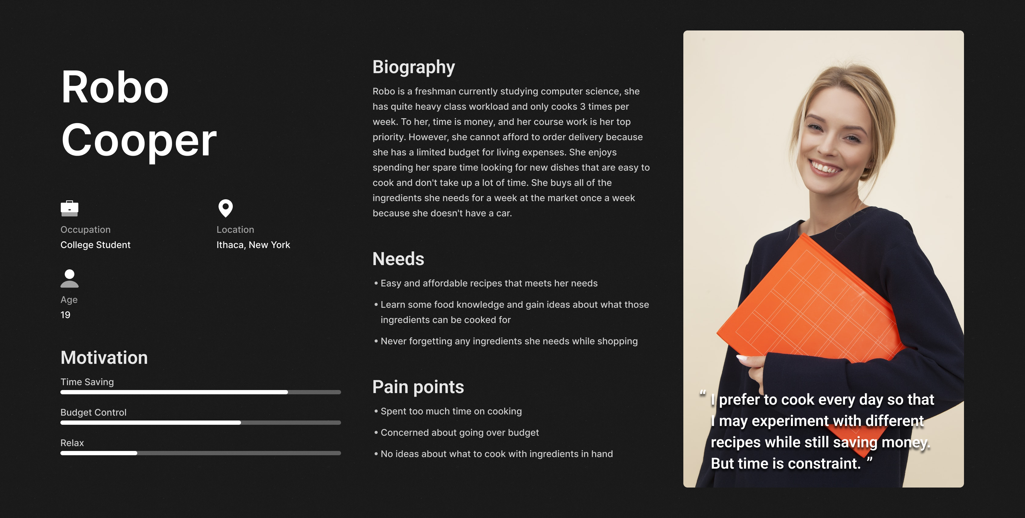
Personas
We sythesized the research insights and created 1 personas to help the entire team better understanding who we're designing for.
Define
Problem Statement
Student needs a more effective way of managing their food plan and collect favorite recipes in order to save time and money while still exploring new recipes.
Design Goal
- Narrow down recipes options quickly
- Allow Students to plan their meal ahead and buy all ingredients at once
- Provide a wide variety of recipe options and food knowledge
We conducted persuasive design as a team to determine the primary potential barriers that prevent individuals from engaged in our target activity. Then, we started brainstorming different ideas that can bring positive behavioral change by either increasing position motivators and simplicity or eliminating factors of demotivation.
In this situation, we want to make it easier for users to plan their meals by reducing the time it takes to find quick and inexpensive affordable recipes and allow them to prepare with less effort. Then, we brainstormed ideas individually and categorized similar ones into groups.

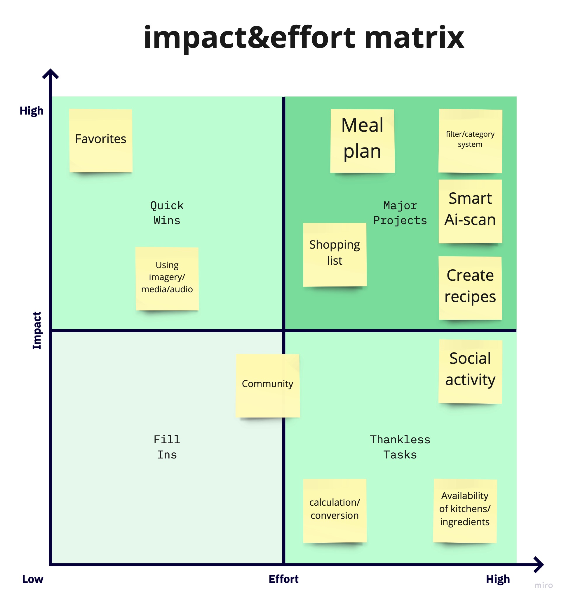
After coming up with 37 ideas in total, we decided to use the Impact & Effort matrix template to prioritize them in order of importance and assess their feasibility. Then we narrow down top 3 ideas from our 12 different concept sketches:
- Meal plan + shopping list
- Scan ingredient to get recipes recommendation
- Upload recipe
Paper Sketch & Wireframe
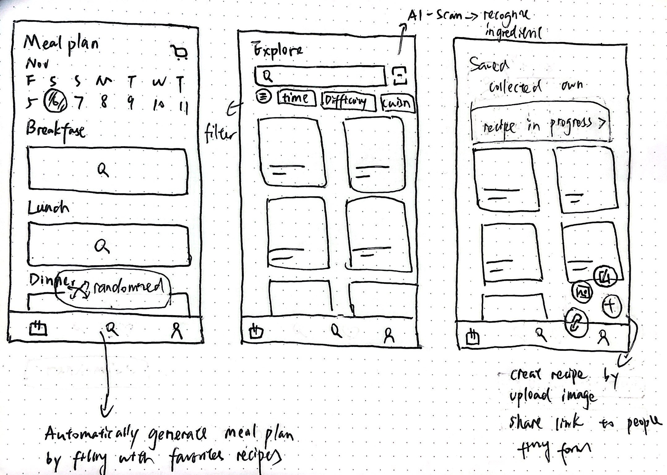
After I finished the information architecture, I started looking into the paper wireframe that allows me to visualize how each component and visual element should be positioned on the page. It also gave me a chance to think about information hierarchy that I can present the content and function in a more structured way. I had a bunch of discussions with the team and I iterated the wireframes to make it more concise and align with everybody's expectation.
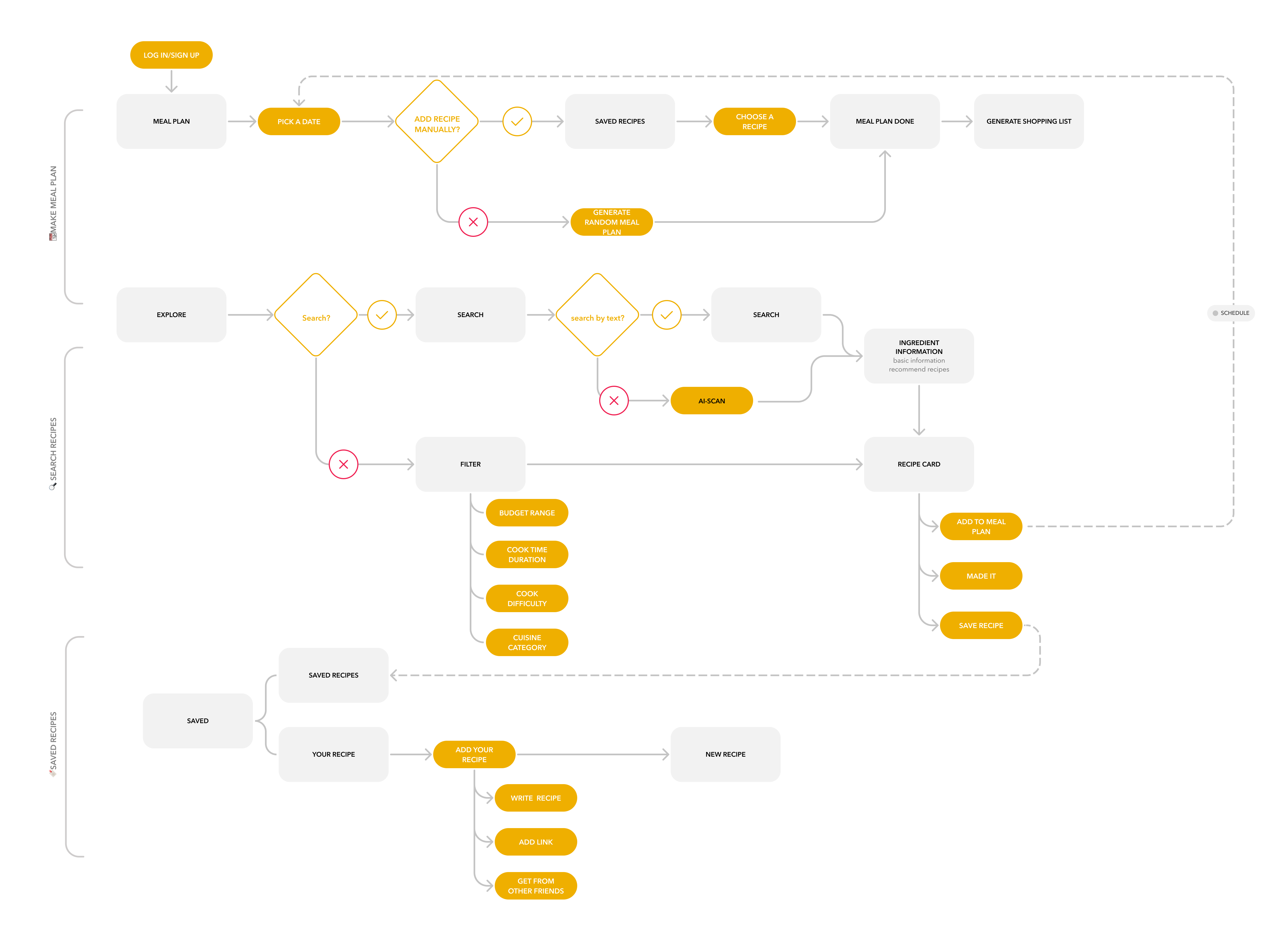
User flow
Now that we had an idea from our minimum viable prototype, we sketched out some ideas and thought about what our app and user interface might look like.
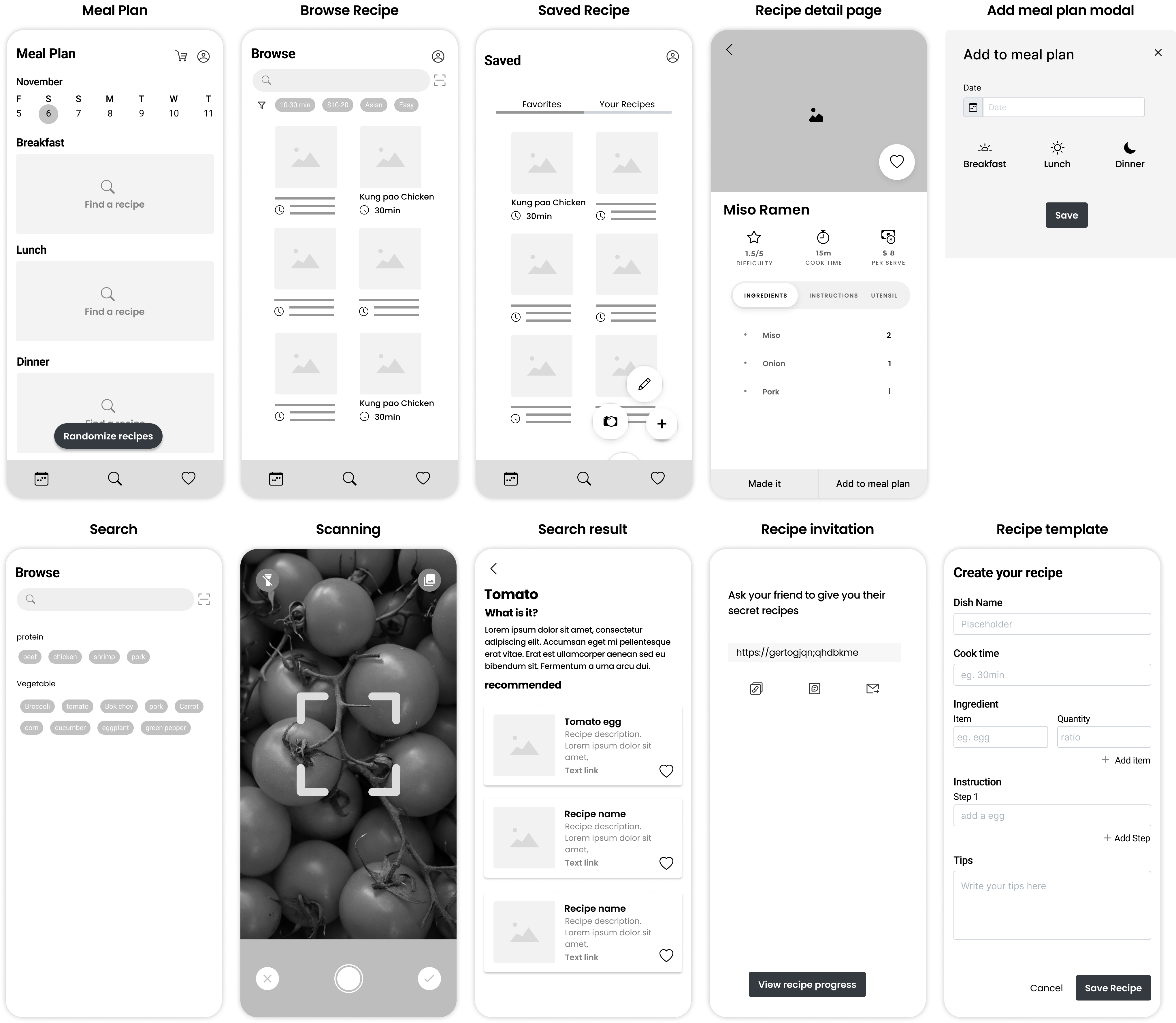
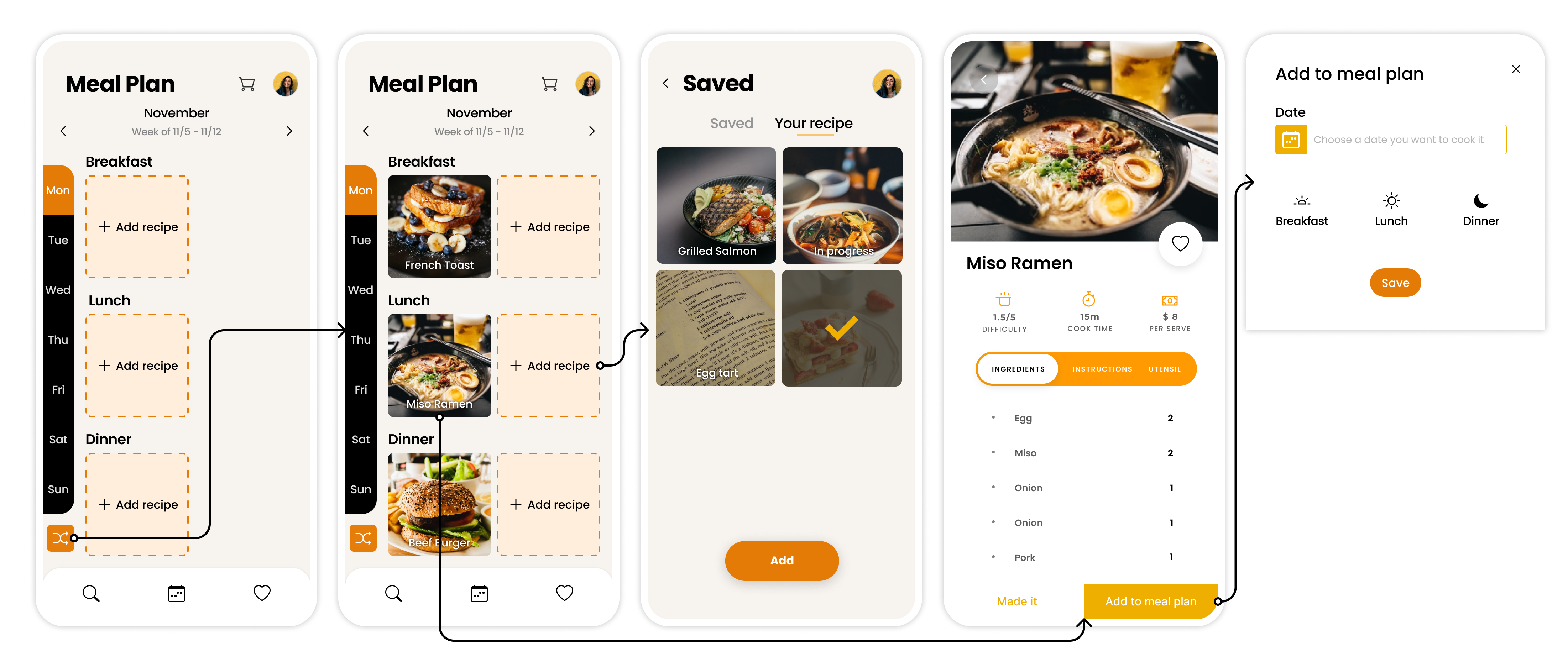
We decided to call out 3 main features:- Meal plan + shopping list : where students could easily plan their weekly meals, get a shopping list with them in market, and let the app picks recipes from your saved lists.
- Scan ingredient to get recipes recommendation : where students can learn new ingredient and get recommended recipes to cook it.
- Upload personal recipe: where students can upload their personal recipes by inputting steps and link, or share link to family and friends to get their secret recipes.
User Testing
To evaluate the usability of our app, our team conducted 5 user tests with some of our wireframes and initial designs with participants. We summarized our main findings below.
Iteration
In order to address the issues uncovered above, we revised our final sketches as such
Iteration 1
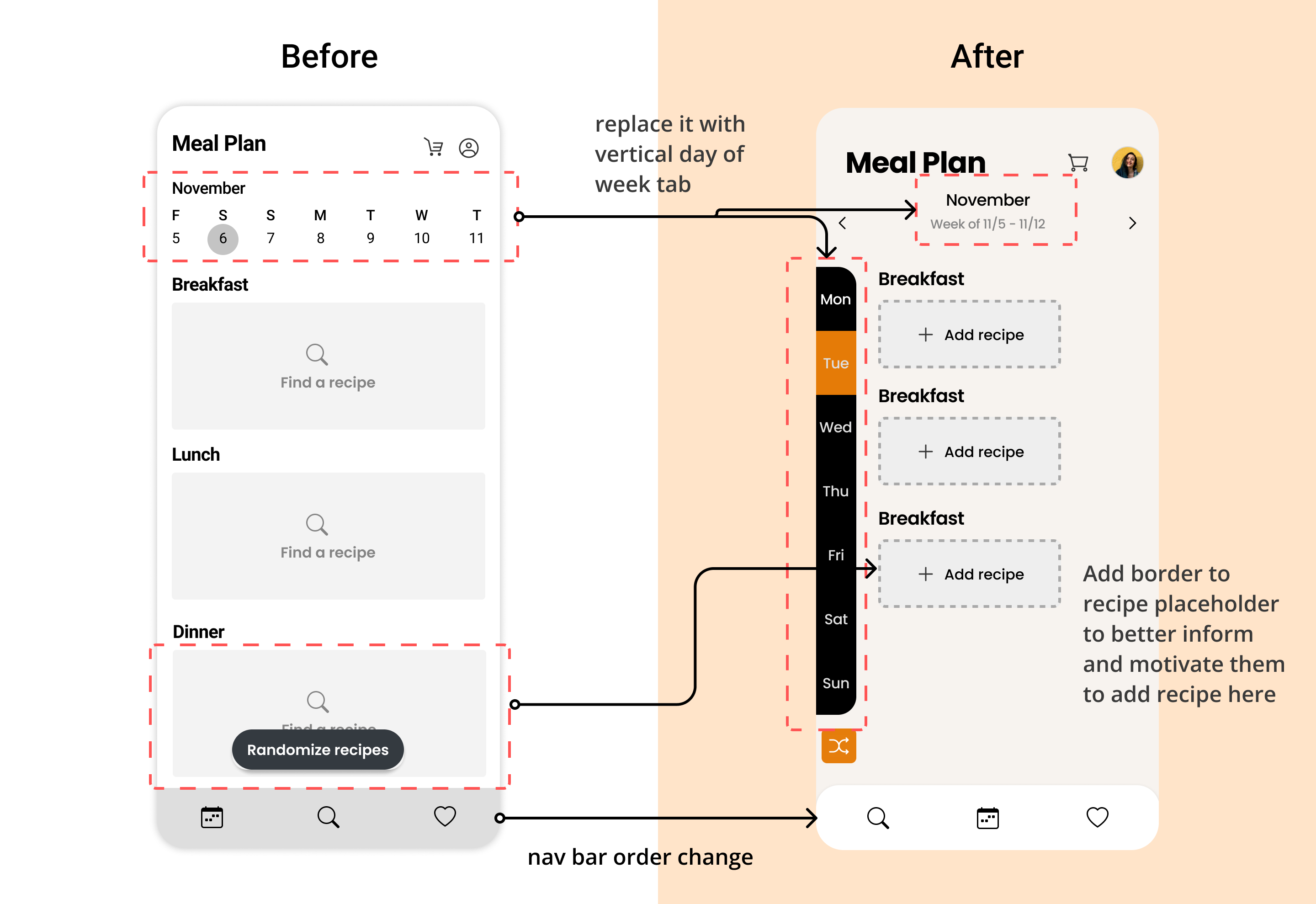
I changed "Find a recipe" to "Add recipes" because generally people are more familiar with the
word “add” and it’s more consistent with user flow that they actually choose recipes from their
saved list.
Even though the scrollable calendar on the top enabled users to pick between day of the week and
date, we thought that 7 tabs on the top navigation would be crowded on smaller devices. We've
also noticed that most users only remember the day of the week rather than the precise date. As
a result, we replaced it with a weekday tab on the left with a larger clickable area and a short
statement to inform users of the month's week.
we also change the meal plan to second tab since user said they want to explore different recipe
when they landing on app rather than seeing empty meal plan.
Iteration 2
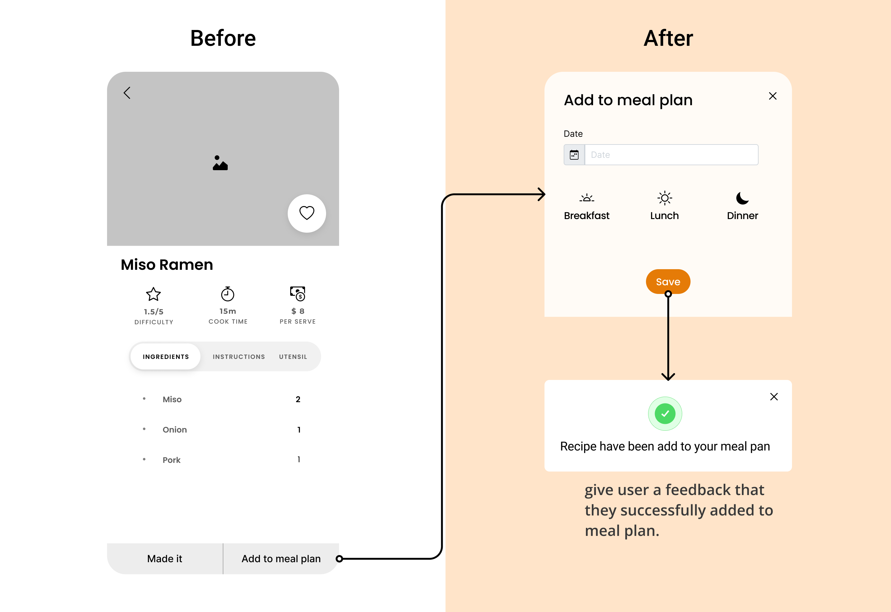
In order to address the lack of feedback,we propose to give confirmation messages in the form of pop-up windows to inform users that activities have been completed successfully,. The message "You've successfully uploaded a recipe" will appear in the popup window.
Iteration 3
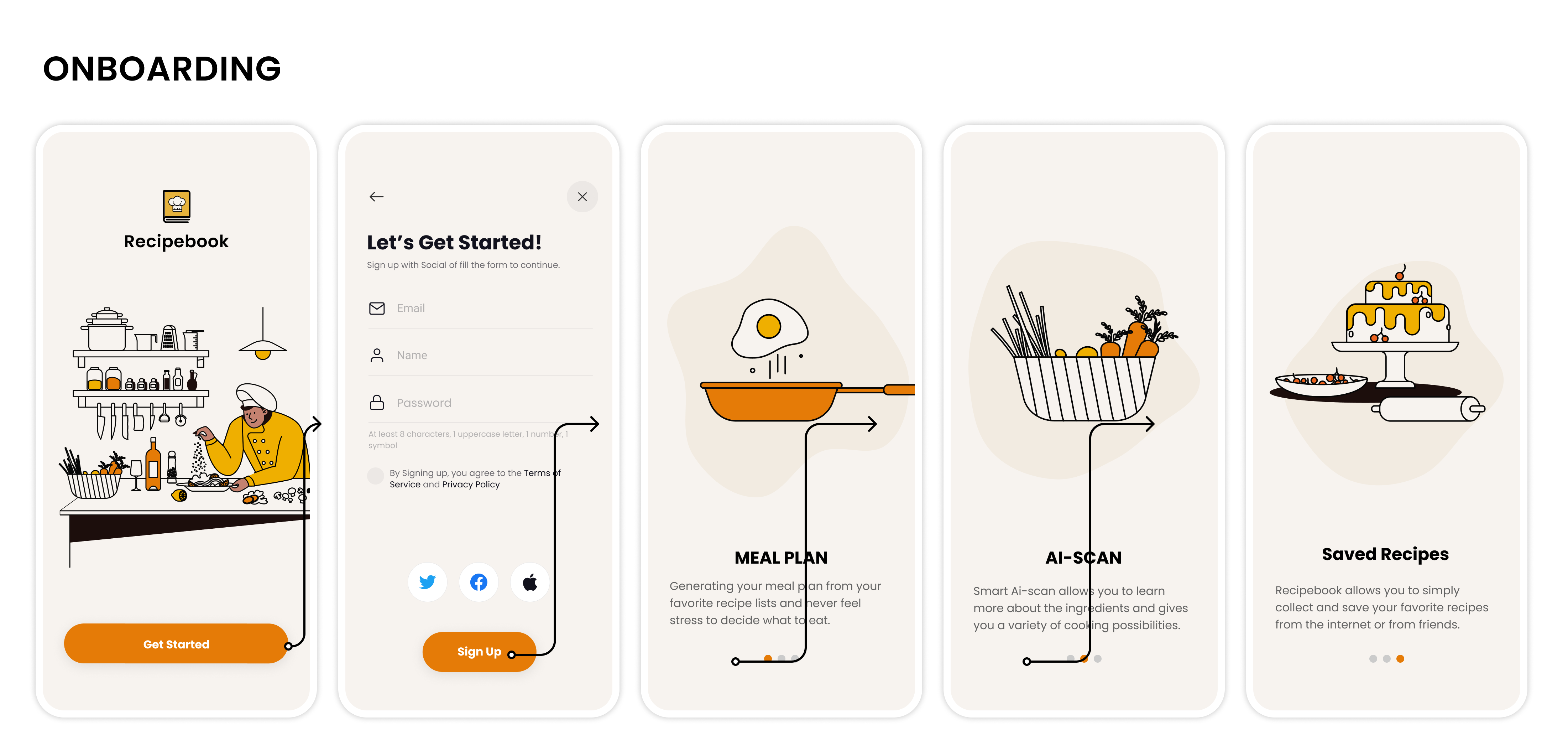
Users takes more than 1 mins in average, in finding how to create their own recipe and invite their friends to edit together and they mentioned that the pop-up buttons are so confused that they barely understand the meaning. Therefore, we integrate the upload image and friend invitation to one page, users would be able to create their recipe in simple steps.

scenario 1: Make meal plan
scenario 2: Seach ingredient

scenario 3: Upload personal recipe

We employed agile methodology to complete this project from user research, UX design, to create interactive prototype with vue.js at final stage. Even though the team was splitter into designers and developers, it is important to help the entire team better understanding who we're designing for and product vision.
FeedbackFeedback is a key indicator of user experience design. It can provide users comfort, confidence, and a sense of security, which allows them to trust the product and gain more motivation while using with it.
I wish to conduct more user testings and iterate on the final design including the label and graphics.
RecruitmentRecruit members who are familiar with front-end development, back-end development to refine this application to usable phase.
